Editor’s Note
This article previews the opening of Bvlgari’s largest-ever exhibition, “BVLGARI KALEIDOS,” in Tokyo. The showcase, designed by renowned studios SANAA and Formafantasma, explores the brand’s signature use of color and craftsmanship.
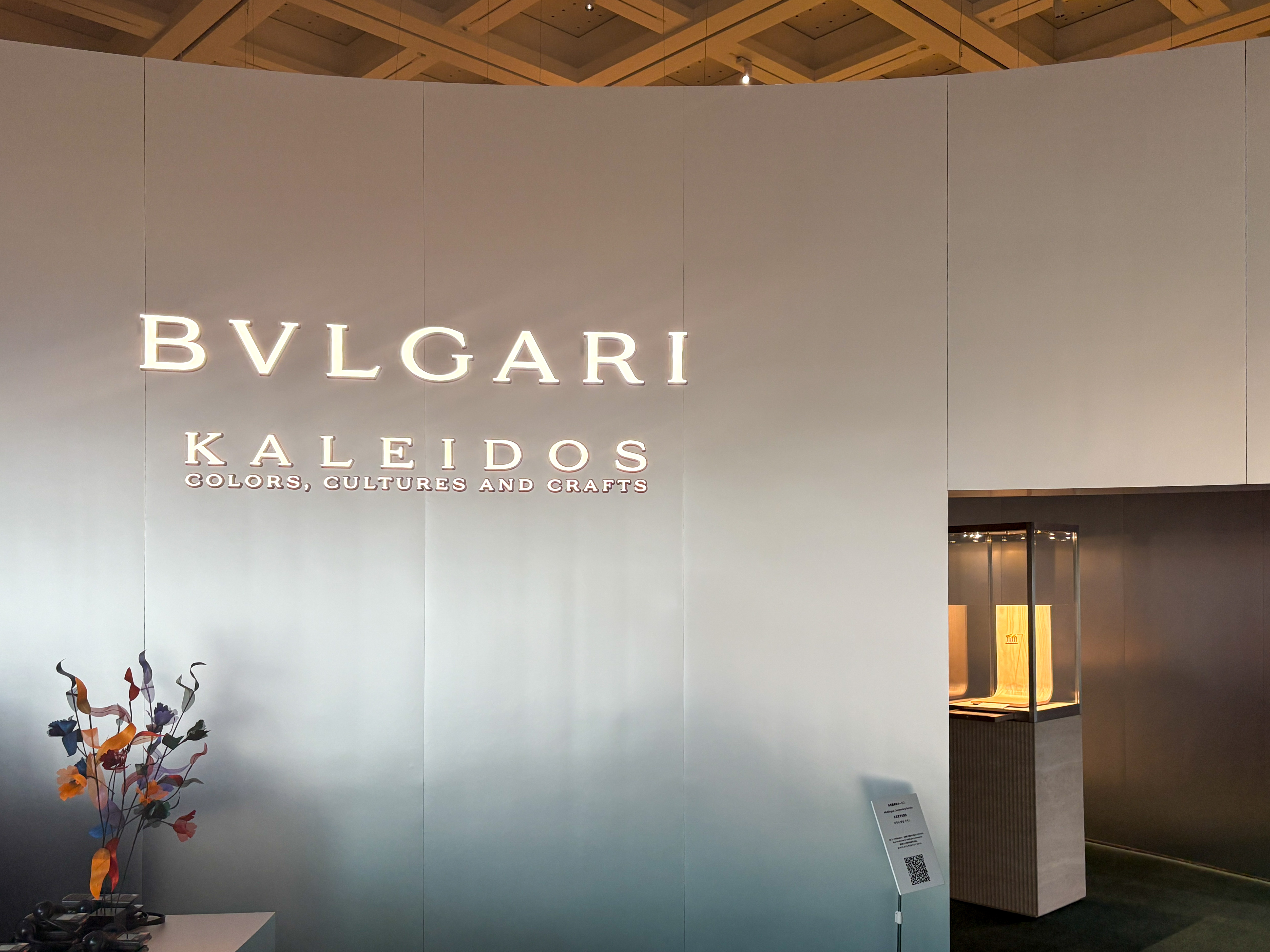
The National Art Center, Tokyo is hosting the exhibition “BVLGARI KALEIDOS: Color, Culture, Craftsmanship,” themed around the color and craftsmanship of the Roman high jewelry maison Bvlgari. The exhibition period is from September 17 to December 15. The scenography (spatial design) is handled by the architectural unit SANAA and the Italian design unit Formafantasma.
The “Kaleidos” in the exhibition title is a word derived from the Greek words for “beautiful (kalos)” and “form (eidos).” The venue features approximately 350 pieces of jewelry meticulously selected from the Bvlgari Heritage Collection and precious private collections, alongside works by three artists: Lara Favaretto, Mariko Mori, and Akiko Nakayama. This exhibition showcases the brand’s history and its relationship with Japan, while also shining a light on the story of “color,” a key identity of the brand.
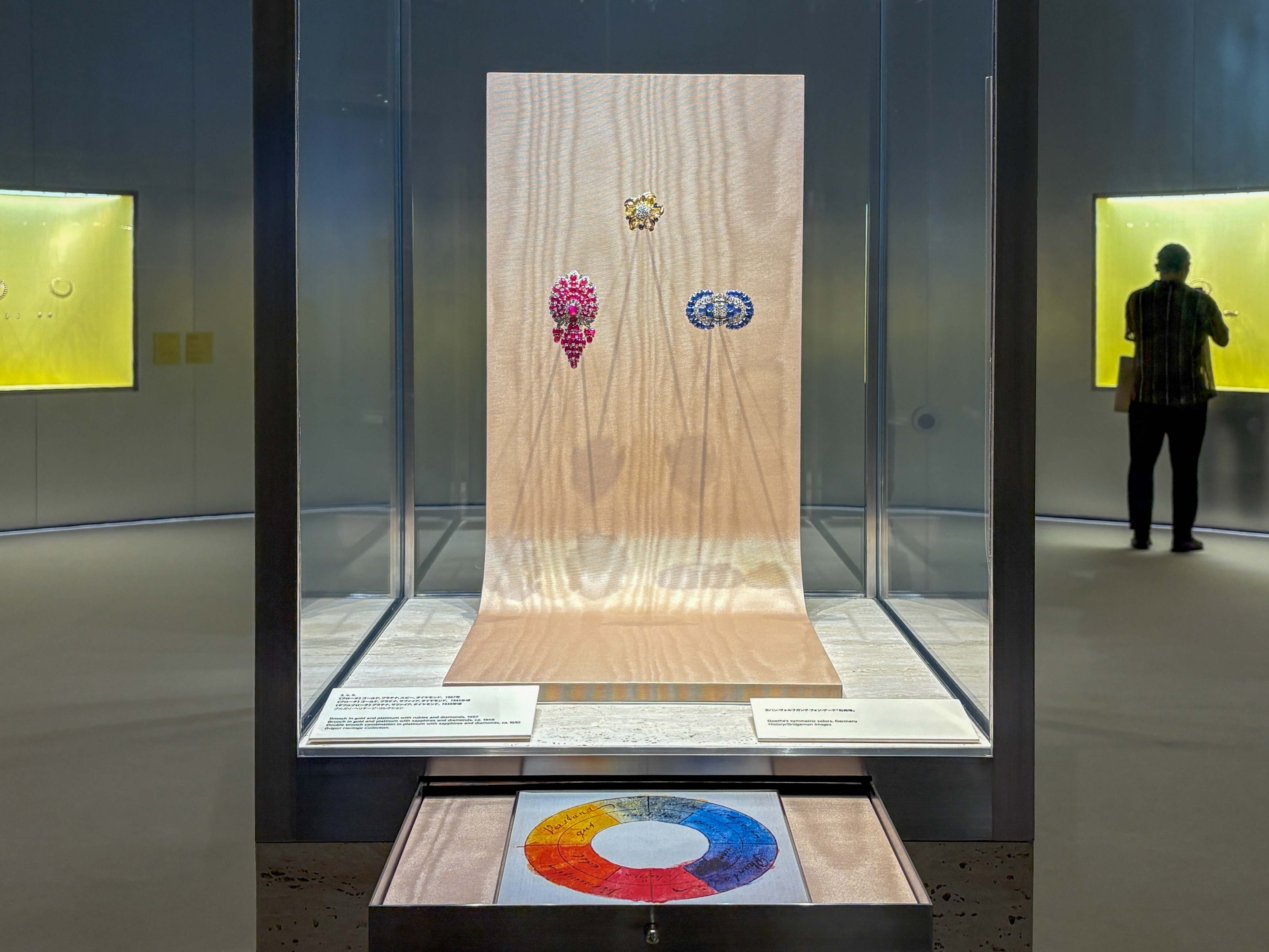
The opening of Chapter 1 is adorned by the “color wheel” devised by the German poet and philosopher Johann Wolfgang von Goethe and jewelry related to the three primary colors he proposed. Goethe, who studied the physiological effects of color in the 19th century, proposed “red,” “yellow,” and “blue” as the three primary colors. In the world of jewelry, these three colors correspond to “ruby,” “gold,” and “sapphire,” respectively, and are treated as some of the most important materials.
Proceeding through the exhibition rooms, the next display is “A Method for Defining and Naming Colors” by the French chemist Michel-Eugène Chevreul. From here, the exhibition unfolds with keywords such as “secondary colors” created by combining primary colors and “complementary colors” where primary and secondary colors complement each other. The 20th century, when Bvlgari caused a color revolution in the jewelry world, was an era where scientific research on color and diverse color practices by artists progressed simultaneously. Artists and designers, whether consciously or unconsciously, created works incorporating new color theories, which was also relevant for jewelers.
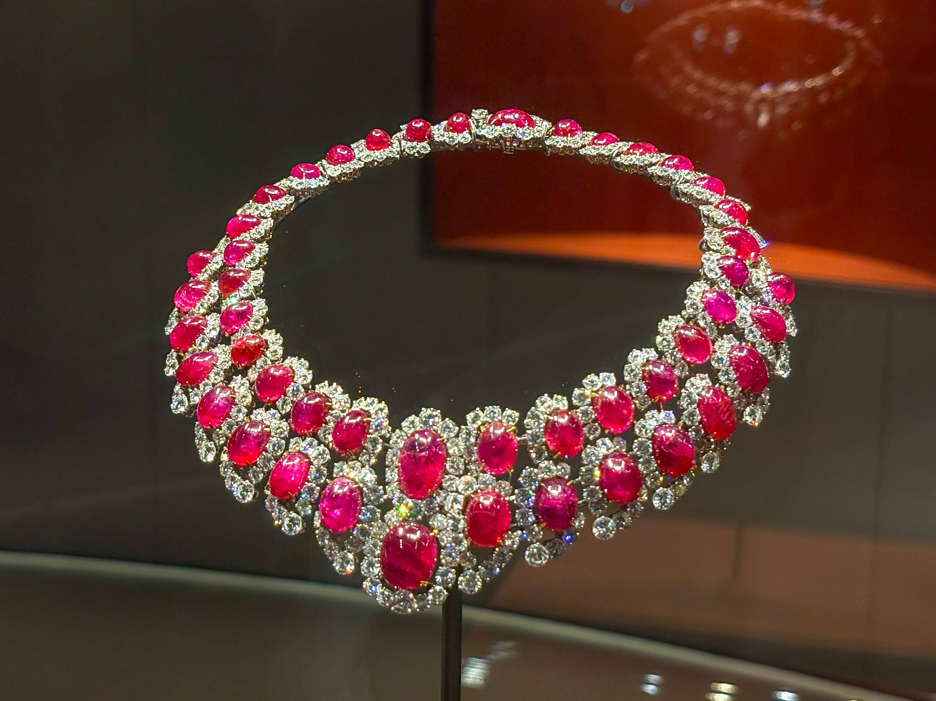
The impressive “Bangle” (1954-55), crafted in platinum with sapphires, rubies, and diamonds, is a piece characterized by Bvlgari’s signature contrast of red and blue. The iconic color combination is further accentuated by the maison’s characteristic cabochon cut. In this way, Bvlgari’s jewelry reveals a conscious awareness of the aforementioned complementary colors and Chevreul’s color theory throughout.
Bridging Chapter 1 to Chapter 2 is the site-specific installation “Level 5” by Lara Favaretto. This marks the artist’s first major introduction in Japan. The car wash brushes, designed to move independently, begin to deteriorate from the moment they are activated in the exhibition room, resonating with the theme of movement and color transformation that runs throughout the entire exhibition.
Chapter 2 focuses on the cultural and symbolic aspects of color. The first half of this chapter introduces how the maison has expressed “white” by leveraging its expertise in diamond cutting. White, which carries different meanings across cultures such as “purity,” “integrity,” or “death,” is regarded in Bvlgari’s jewelry as more than mere negative space.
The legendary “Necklace” (1961), crafted in platinum with diamonds and seven magnificent emeralds, is a special piece also known as the “Seven Wonders.” Emerald, a representative gemstone of “green,” has long been a symbol of “nobility” in Western tradition. This piece has also been favored by celebrities such as Italian actresses Monica Vitti and Gina Lollobrigida.
Of course, the jewelry is a highlight, but the exhibition space designed by SANAA is also a major attraction. Based on materials like aluminum and acrylic, the exhibition space, possessing the two opposing attributes of reflection and transparency, is designed so that the beauty of the jewelry spreads throughout the entire space. Furthermore, the shape of each exhibition room is modeled after the ginkgo leaf, a motif chosen as a symbol connecting the two locations of Rome and Japan.
The act of wearing accessories (adornment) itself is not unrelated to the emotions and symbolism of color. The serpent (Serpenti) motif, which frequently appears from Chapter 2 onwards, has been treated as a symbol of “wisdom, vitality, and eternity” since ancient times and originates from the ancient Greek and Roman culture that forms the roots of the Italy-based maison. The colorful scales of the serpent serve not to evoke fear but to empower the wearer.
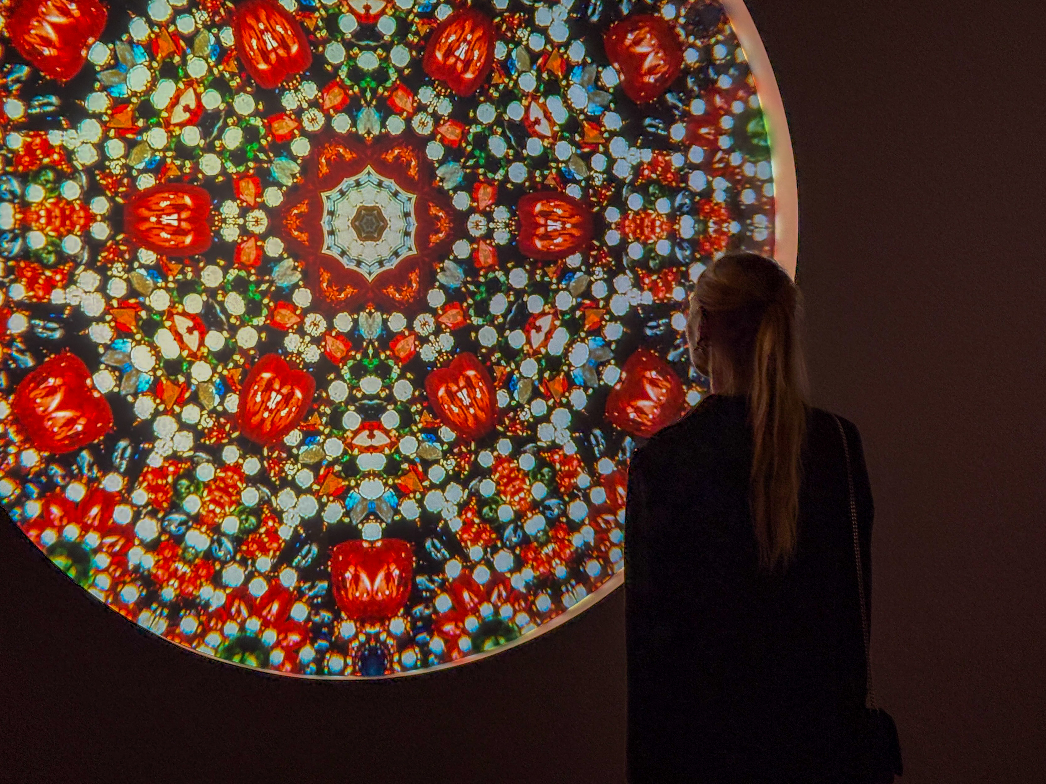
Displayed between Chapters 2 and 3 is Mariko Mori’s new work “ONOGORO STONE Ⅲ.” Inspired by the creation myth in Japan’s oldest book, the “Kojiki,” this piece embodies Mori’s interest in exploring the boundary between spirituality and cutting-edge technology. The three-dimensional work, resembling a mineral, shimmering with rainbow-colored light, smoothly transitioned the exhibition to the next chapter, “The Power of Light.”
Chapter 3 focuses on the role of light in our perception of color, exploring particularly how light interacts with reflective materials such as silver and gold. Founder Sotirio Bulgari began his career as a silversmith before founding the brand, and such silverwork pieces symbolize the early era.
Since its founding, silverwork pieces have been continuously created. This exhibition offers a glimpse into a precious aspect of the maison’s production, including plates inscribed with addresses like Rome’s famous monuments and “Via dei Condotti,” where the flagship store is located.
At the end of the exhibition room, the “Convertible Sortilège-Bracelet” (circa 1969), also used in the exhibition’s key visual, and Akiko Nakayama’s video installation “ECHO” are juxtaposed as if resonating with each other. The “Convertible Sortilège-Bracelet,” lavishly using rare jewelry including fancy color diamonds and pearls, embodies the richness of Bvlgari’s color and its narrative, brilliantly concluding the exhibition. This exhibition, featuring Bvlgari’s precious jewelry on the largest scale to date, is one you’ll want to visit before it gets crowded.