Editor’s Note
**Editor’s Note:** This report details a case of alleged fraud in Ghaziabad, where a government employee claims two jeweler brothers sold him fake jewelry worth ₹7 lakh for his sister’s wedding. The matter is now under police investigation.
A man working as an Assistant Section Officer in a department of the central government has accused two jeweler brothers from Indirapuram of defrauding him of seven lakh rupees. The victim had ordered jewelry from them for his sister’s wedding. Later, when he got it checked elsewhere, it was found to be fake. A complaint has been filed at the Indirapuram police station.
Jatin, a resident of Shakti Khand-2 in the Indirapuram police station area, lives with his family. He works as an Assistant Section Officer in a central government department.
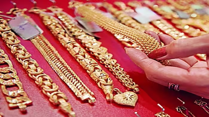
He said that his sister’s wedding was scheduled for April 18, for which he had ordered jewelry from Tarun and Pankaj Kapoor, owners of a jewelry shop located in Nitikhand-2, Indirapuram. For this, he also gave them his own three-tola bangle to make gold bangles for his sister. He paid approximately three and a half lakh rupees online and 73,000 rupees in cash. The jeweler made a three-tola necklace, a one-and-a-quarter-tola chain, and tops. He had ordered this jewelry in good quality gold.
He complained to them, but no solution was found. He said that because the jewelry was found to be fake, he had to postpone his sister’s wedding from the scheduled date. The wedding is now scheduled for June. The victim filed a complaint with the police about being cheated. He said that the accused have defrauded him of approximately seven lakh rupees. According to the victim, these people have similarly cheated many others.
The Indirapuram police said that a case has been registered based on the complaint. The matter will be investigated and further action will be taken.
– Hallmark is a mark of gold purity. Always check it when buying jewelry. Orders have been issued that every jeweler must provide this mark on their jewelry. Based on purity, it can be 10k, 14k, 18k, 22k, or 24k.
– You can also check gold purity with vinegar. Put a few drops of vinegar on the gold and observe it carefully after a few minutes. If the color of the gold does not change, it is pure gold. Fake gold will turn black on contact with vinegar.
– Apply a magnet to the gold jewelry. If the jewelry does not stick to the magnet, the gold is real. If a scratch mark on a ceramic stone turns black, the gold is fake; if it turns golden, the gold is real.
– Fill a large vessel with water and drop the gold jewelry into it. If it floats, the gold is fake. Real gold, no matter how light or in what quantity, sinks in water because it is a dense, thick, and hard metal.