Editor’s Note
This article explores how 2014’s trend colors, characterized by muted, nature-inspired hues, set the stage for understanding subsequent fashion cycles.
As the saying goes, ‘Fashion goes in cycles.’ To understand 2015 trends, one must first know the 2014 trends. The Pantone Color Institute, a global color research authority, forecasted 2014 trend colors as low-saturation colors with gray tones, a departure from the previously prominent fluorescent trend. They presented colors extracted from nature, such as Radiant Orchid, Placid Blue, and Violet Tulip.
Designers like Burberry Prorsum, J.W. Anderson, and Paul Smith incorporated these toned-down colors into their collections, hinting at the colors that would become popular in the 2015 season.
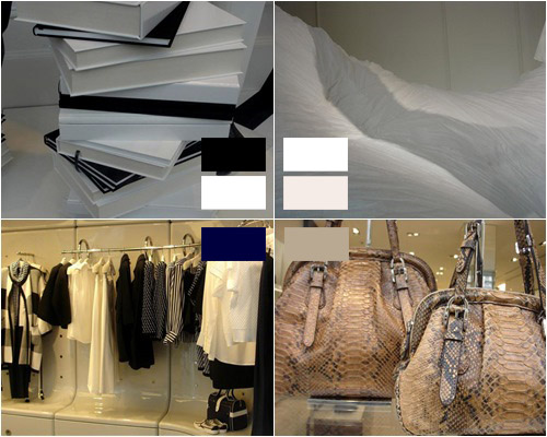
In the Paris fashion market, designs utilizing basic colors accounted for 70-80% of the share, with risky colors being restrained. Overall, basic colors like Black & White, Navy, White, and Neutral-Natural colors took center stage. Unlike previous designs, White and Black were applied together within a single design to create various patterns.
White colors featured noticeable pale tones, ranging from winter whites like Cloud Dancer and White Sand to powdery, soft nude tones with a pink tint, adding a minimal yet modern sensibility.
Brands using Navy colors included Stéphane, Max Mara, and Joseph. They primarily showcased Navy & White stripe designs over Black & White stripes, forecasting that toned-down navy marine looks would be the trend for the season.
Brown colors inspired by nature were also notable, featuring a strong natural terracotta feel reminiscent of red clay rather than a cold impression. Additionally, natural colors like Dark Olive, Plantation, and Tobacco Brown, which added a primitive sensibility, were proposed, suggesting the fashion industry would move towards a more lyrical and humanistic, emotional direction.
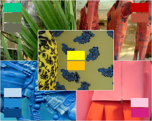
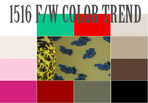
Point colors included Golden Rod, Olympian Blue, Shimmer Green, the unreal-sensed Candy Pink, high-saturation Scarlet Red, and the classically intense Intense Red. These colors drew inspiration from industrial forms based on natural value and pragmatic humanistic sensibility, as well as supernatural sensations that stimulate imagination.
Even when using the same red color, designers added an intense feel by incorporating natural colors. A neutralized color palette was also proposed, featuring colors like Shimmer Green.
An industrial-sensed intense bright color palette, including Golden Rod, Seaport, and Olympian Blue, was suggested, adding vitality with a fiery red of vivid saturation on an opaque base.
This palette consisted of ‘marketable’ neutralized colors rather than flashy ones and is expected to be widely applied across cosmetics, fabrics, and interior accessories.